Saturday, May 29, 2010

Would You Trust Truth Fudgers?

In conversations that I have with AGW supporters from time to they often try to use Scientific Authority over factual information to support their argument. Comments such as "The Royal Society supports it" or "NASA says.." or in a more local context "The scientists from the CSIRO support.."But is authority the be all and end all in proving your case? Many supporters of AGW would have you believe that it is and that it is not only foolish to doubt them but even morally questionable to do so. Yet these same supporters would often once quote the Climate Research Unit of the University of East Anglia as "the" authoritative source of temperature measurement, yet since the unveiling of the Climategate emails and data the use of this authority is no longer used with any great regularity. So what then of the Royal Society, NASA and the CSIRO? They weren't involved in Climategate so there can't be any problems with what they say can there? These three articles may shed some light on recent changes or (very quiet) corrections that these three scientific pillars have recently made:

1. The Royal Society:

The UK's Royal Society is reviewing its public statements on climate change after 43 Fellows complained that it had oversimplified its messages.

They said the communications did not properly distinguish between what was widely agreed on climate science and what is not fully understood.

The society's ruling council has responded by setting up a panel to produce a consensus document.

...The review member said it might not be possible for the document to be agreed at all. "This is a very serious challenge to the way the society operates," I was told. "In the past we have been able to give advice to governments as a society without having to seek consensus of all the members.

...A Royal Society pamphlet Climate Change Controversies is the main focus of the criticism. A version of it is on the organisation's website. It was written in response to attacks on mainstream science which the Royal Society considered scurrilous.

It reads: "This is not intended to provide exhaustive answers to every contentious argument that has been put forward by those who seek to distort and undermine the science of climate change…"

One Fellow who said he was not absolutely convinced of the dangers of CO2 told me: "This appears to suggest that anyone who questions climate science is malicious. But in science everything is there to be questioned - that should be the very essence of the Royal Society. Some of us were very upset about that.

Whilst this is a relatively small change by the Royal Society it is as journalist Gerald Warner of the U.K. Telegraph puts it:

This development does not, of course, mean that the Royal Society is embracing climate scepticism. On the contrary, it is very reluctantly modifying its stance to accommodate some of its Fellows who take the very scientific position that a degree of agnosticism is good practice when hypotheses remain unproven. Yet this retreat from absolutist global warming orthodoxy will deeply dismay the AGW lobby. For years, there was no fiercer proponent of the AGW theory than the Royal Society. Its previous president Lord May notoriously stated: “The debate on climate change is over.”

But it is an admission on some level that the science is not settled and that the debate is far from over.

2. NASA:

NASA covered up for forty years proof that the greenhouse gas theory was bogus. But even worse, did the U.S. space agency fudge its numbers on Earth’s energy budget to cover up the facts?

As per my article this week, forty years ago the space agency, NASA, proved there was no such thing as a greenhouse gas effect because the ‘blackbody’ numbers supporting the theory didn’t add up in a 3-dimensional universe:

"During lunar day, the lunar regolith absorbs the radiation from the sun and transports it inward and is stored in a layer approximately 50cm thick....in contrast with a precipitous drop in temperature if it was a simple black body, the regolith then proceeds to transport the stored heat back onto the surface, thus warming it up significantly over the black body approximation..."

Thus, the ‘blackbody approximations' were proven to be as useful as a chocolate space helmet; the guesswork of using the Stefan-Boltzmann equations underpinning the man-made global warming theory was long ago debunked. If NASA had made known that Stefan-Boltzmann's numbers were an irrelevant red-herring then the taxpayers of the world would have been spared the $50 billion wasted on global warming research; because it would have removed the only credible scientific basis to support the theory that human emissions of carbon dioxide changed Earth’s climate.

But, until May 24, 2010 these facts remained swept under the carpet. For the Apollo missions NASA had successfully devised new calculations to safely put astronauts on the Moon-based on actual measured temperatures of the lunar surface. But no one appears to have told government climatologists who, to this day, insist their junk science is 'settled' based on their bogus ‘blackbody’ guesswork.

Again we find that the science isn't settled and that the debate is far from over and that the data may well have been disguised as it was inconvenient to the prevailing (unproven) theory on AGW. Which leads the author to conclude:

Thanks to Siddons and his co-authors of ‘A Greenhouse Effect on the Moon,’ the world now has scientific evidence to show the greenhouse gas theory (GHG) was junk all along.

As the truth now spreads, an increasing number of scientists refute the greenhouse gas theory, many have been prompted by the shocking revelations since the Climategate scandal. The public have also grown more aware of how a clique of government climatologists were deliberately ‘hiding the decline’ in the reliability of their proxy temperature data all along.

But NASA’s lunar temperature readings prove that behind that smoke was real fire. Some experts now boldly go so far as to say the entire global warming theory contravenes the established laws of physics.

How NASA responds to these astonishing revelations may well tell us how politicized the American space agency really is.

3. CSIRO:

FEDERAL Treasury and the CSIRO are supposed to be among the most trusted institutions in Australia. They are both supposed to be founded in objective rationalism.

...From the CSIRO we need, very simply, good science. As its own strategic plan puts it: "We are committed to scientific excellence and working ethically and with integrity in everything we do."

Both have, in their separate ways, breached that trust. This is a very serious matter for the governance of Australia. If we can't trust Treasury to give us rational economics and we can't trust the CSIRO to give us good, or even just honest, science -- as in both cases they have generally done for a good three-quarters of a century or more -- we are adrift in a sea of irrationalism.

For that, indeed, is what links the two failures: in each case an apparent triumph of theology over reason. First the CSIRO.

In March, it joined with the Bureau of Meteorology to produce a "snapshot of the state of the climate to update Australians about how their climate has changed and what it means". Although the pamphlet had a neutral title, "State of the Climate", it was clearly designed to bring the great weight of the apparent credibility of these two organisations to bear against, and hopefully crush, those pesky climate change sceptics.

But as one of the peskier of them, Tom Quirk -- our version of Canada's even peskier Stephen McIntyre -- discovered, there was a very curious omission in one of the CSIRO graphs. It showed the rise and rise of concentrations in the atmosphere of carbon dioxide and its fellow greenhouse gas methane. It was an almost perfect replica of the infamous (Michael) Mann Hockey Stick. After being virtually stable for 900 years, concentrations of both CO2 and methane went almost vertical through the 20th century. But as the eagle-eyed Quirk noticed and wrote about on Quadrant Online, methane was plotted only up to 1990, while the plots for CO2 continued to 2000.Why so, when the CSIRO measures methane concentrations and has data up to last year?

Did the answer lie in the inconvenient truth that methane concentrations have plateaued since the mid-1990s? Yet here is the CSIRO, the organisation dedicated to scientific truth, pretending -- even stating -- that they're still going up, Climategate style. This is bad enough, but just as with Treasury, real policies are built on this sort of "analysis". The first version of the so-called carbon pollution reduction scheme included farming to address the methane question. But as Quirk has shown in a peer-reviewed paper, atmospheric methane is driven by a combination of volcanos, El Ninos and pipeline (mostly dodgy old Soviet) leakage.

A second curious, and even dodgier, thing happened after Quirk's Quadrant report. CSIRO "updated" its main graph to include the more recent methane data. No admission was made and the graph's scale made it all but invisible and did not show the plateauing. Further, the CSIRO published a more detailed second graph showing what has happened in the past 30 years, as opposed to the first graph's 1000 years. But only for CO2, despite the fact that it had exactly the same data for methane.

In short, the CSIRO is a fully signed-up member of the climate change club. It wanted to project the horror story of continually rising greenhouse gas concentrations in the atmosphere. So it simply disappeared inconvenient evidence to the contrary, in the process announcing it cannot be trusted ever again to deliver objective scientific evidence.

But it didn't end there. Tom Quirk in his article CSIRO Blame Game states:

P. Fraser, a senior CSIRO scientist, reveals how a major document branded by the organisation was published and promoted. Apparently, the final draft “State of the Climate” report was not reviewed by CSIRO or BOM scientists themselves, and when it is questioned others are blamed for the errors it contains and the confused dating of information.

Fraser makes the point that the CSIRO team were the first to report a rise in methane again towards the end of 2006 at the end of the omitted plateau. The work of the group in atmospheric measurements is first class and arguably occasionally better than some of their US colleagues but their over eager interpretation may lead them astray. The claim of rising methane is an example (Figure 1) as the latest published measurements suggest otherwise with a decreasing trend.

Figure 1: Recent measurements of atmospheric methane. Instantaneous growth rate for globally averaged atmospheric methane (solid line; dashed lines are ±1 standard deviation).

The IPCC does not understand or cannot explain the behaviour of atmospheric methane. The CSIRO has done no better. Only time for more measurements and a better understanding of the sources and sinks of methane will resolve this issue. The science is uncertain and not a basis for any policy making that has the potential to cripple a large part of the coal mining industry.

More transparency and less selective presentation would help.

Whilst none of these articles disprove the theory of AGW what they do show is the levels of uncertainty that are still out there on AGW. Also they show that the argument of "authority" is often nothing more than that. It is not a statement of "fact." As Dr. Richard Lindzen puts it when speaking about "scientific authority":

What we are seeing again is the tendency for any claims to be made once the basis for the claim need only be ‘authority.’ Interestingly, the ‘authority’ frequently doesn’t say what it is claimed to have said. However, advocates (especially when in high government position) can rest assured that some ‘authority’ will come along to assent.

His slide show on Deconstructing Global Warming can be seen here.

Saturday, April 17, 2010

Climategate Enquiries And The Tom Sawyer Effect

Since the "Climategate" scandal broke at the end of 2009 there have been a number of enquiries set up to look at various aspects of the scandal. To that end if the first two to report back are any indication, the enquires are more of an attempt to tidy up the mess left by the scientists involved and absolve them of any wrong doing rather than examine any of the issues that were legitimately raised by the exposed emails and data. Journalist Christopher Booker looks at this in his article: Climategate: a scandal that won’t go away. (Any emphasis added is mine).

If you were faced with by far the biggest bill of your life, would you not want to be confident that there was a very good reason why you should pay it? That is why we need to know just how far we can trust the science behind the official view that the world is threatened with catastrophe by global warming – because the measures proposed by our politicians to avert this supposed disaster threaten to transform our way of life out of recognition and to land us with easily the biggest bill in history. (The Climate Change Act alone, says the Government, will cost us all £18 billion every year until 2050.)

Yet in recent months, as we know, the official science on which all this rests has taken quite a hammering. Confronted with all those scandals surrounding the “Climategate” emails and the UN’s Intergovernmental Panel on Climate Change,
the political and academic establishments have responded with a series of inquiries and statements designed to show that the methods used to construct the official scientific case are wholly sound. But as was illustrated last week by two very different reports, these efforts to hold the line are themselves so demonstrably flawed that they are in danger of backfiring, leaving the science more questionable than ever.

The first report centred directly on the IPCC itself. When several of the more alarmist claims in its most recent 2007 report were revealed to be wrong and without any scientific foundation, the official response, not least from the IPCC’s chairman, Dr Rajendra Pachauri, was to claim that everything in its report was “peer-reviewed”, having been confirmed by independent experts.

But a new study put this claim to the test. A team of 40 researchers from 12 countries, led by a Canadian analyst Donna Laframboise, checked out every one of the 18,531 scientific sources cited in the mammoth 2007 report. Astonishingly, they found that nearly a third of them – 5,587 – were not peer-reviewed at all, but came from newspaper articles, student theses, even propaganda leaflets and press releases put out by green activists and lobby groups.

In its own way even more damaging, however, was the report from a team led by Lord Oxburgh on the scientific integrity of the East Anglia Climatic Research Unit (CRU). Two sets of evidence have been used more than anything else to drive the worldwide scare over global warming. One is a series of graphs showing how temperatures have suddenly shot up in recent decades to levels historically unprecedented. The other is the official record of global surface temperatures. For both of these, the CRU and the key group of top British and American scientists involved in those Climategate emails have been crucially responsible.

Lord Oxburgh himself is linked to various commercial interests which make money from climate change, from wind farms to carbon trading. None of the panel he worked with on his report were climate “sceptics”; and one, Dr Kerry Emanuel, is an outspoken advocate of man-made global warming. Even so, it was surprising to see just how superficial their inquiry turned out to be, based on two brief visits to the CRU and on reading 11 scientific papers produced by the research unit in the past 24 years, chosen in consultation with the Royal Society (which is itself fanatical in promotion of warming orthodoxy).

The crown jewels of the IPCC’s case that the world faces catastrophic warming have been all those graphs based on tree rings which purport to show that temperatures have lately been soaring to levels never known before in history – thus eradicating all the evidence that the world was hotter than today during the Medieval Warm Period, long before any rise in CO2 levels. Best known of these graphs, of course, was Michael Mann’s “hockey stick”, comprehensively discredited by the expert Canadian statistician Stephen McIntyre and Professor Ross McKitrick. But the IPCC was able to defend its case with the aid of another set of “hockey sticks”, based on different tree rings, produced by Mann’s close allies at the CRU.

The most widely quoted of the Climategate emails was that from the CRU’s director, Philip Jones, saying that he had used “Mike’s Nature trick” to “hide the decline”. If there was anything in the CRU’s record which a proper inquiry should have addressed it was the story behind this email, because what it highlighted was the device used by the CRU to get round the fact that its tree-ring data hopelessly failed to show the result the warmist establishment wanted. When their Siberian tree rings showed temperatures in the late 20th century sharply dropping rather than rising, the “trick” used by Prof Jones and his colleague Dr Keith Briffa, copied from Mike Mann’s own “hockey stick”, was simply to delete the downward curve shown by the tree rings, replacing them with late 20th-century temperature data to show the dramatic warming they wanted.

The significance of this sleight of hand can scarcely be exaggerated. Why, in using this misleading graph, did the IPCC not explain the trick that had been played by its leading scientists? If tree rings were so inadequate in reflecting 20th-century temperatures, why should they be relied on to reflect temperatures in earlier centuries? Why, when fresh Siberian tree ring data came to light, making a nonsense of the CRU’s earlier temperature reconstructions, did the CRU simply ignore the new data?

Anyone who has followed the meticulous analysis of this curious story by Steve McIntyre on his Climate Audit website might well conclude that we are looking here at a complete travesty of proper scientific procedure, matched only by the bizarre methods used by Mann himself to construct his original hockey stick. Yet these are the men, Mann, Jones and Briffa, who acted as the “lead authors” of the key chapters of the IPCC’s 2001 and 2007 reports.

They quite shamelessly promoted the rewriting of history produced by themselves and a small group of colleagues – the so-called Hockey Team – which the IPCC in turn used as its main evidence to convince the politicians that the world faces unprecedented warming.

Yet scarcely a hint of this hugely important story is contained in the Oxburgh report, which simply glosses it over, hoping to appease critics by throwing in a few vaguely critical comments about how Jones and his team were a trifle “disorganised” in archiving their data. It ignores the utterly damning critiques of the CRU’s methodology produced by McIntyre and McKitrick. It does not even begin to question the way the CRU has compiled its global temperature record, relied on by the IPCC as the most authoritative of all the official data sources for surface temperatures.

Yet this in turn has given rise to all sorts of controversies, not least when Prof Jones last year admitted that much of his data had been “lost” (following his repeated refusals of applications to see it by McIntyre and others). More damaging still was the charge by senior Russian scientists that, in compiling its global record, CRU had cherry-picked the data supplied from Russia, suppressing that from most of the country while retaining the data from the vicinity of cities which, thanks to the “urban heat island” effect, showed a warming trend. So even the accuracy of CRU’s temperature record has been called seriously in doubt, although one would never have guessed it from Oxburgh.

As is reflected in so many political tragedies, from Macbeth to Watergate, it is often not the original dark act itself which leads to nemesis but the later attempts to “trammel up the consequence”. Nothing will do more to reinforce suspicion of the CRU’s conduct than the failure, first by those MPs, and now by the team led by Lord Oxburgh, to address properly the way in which it appears to have abused the principles of true science – a scandal which should be of concern not just to us here in Britain, who paid for it, but across the world.

So many enquires so few real questions answered. Adding these two to the one by Pennsylvania University (by his peers) which exonerated Dr. Michael Mann it could be said that: Never in the course of human history have so many enquiries been needed to cover so many mistakes made by so few. Tom Sawyer would be proud.

Friday, April 9, 2010

Dr. Richard Lindzen - The Earth Is Never In Equilibrium


The following is an essay by Professor Richard Lindzen (seen above) of MIT that he originally sent to the Free Lance-Star in Fredericksburg, Va for their Opinion Page in March. It was recently republished in the Janesville, WI Gazette Extra. In it he raises some important points for us all to consider about AGW (I have provided some emphasis on some of them).

To a significant extent, the issue of climate change revolves around the elevation of the commonplace to the ancient level of ominous omen. In a world where climate change has always been the norm, climate change is now taken as punishment for sinful levels of consumption. In a world where we experience temperature changes of tens of degrees in a single day, we treat changes of a few tenths of a degree in some statistical residue, known as the global mean temperature anomaly (GATA), as portents of disaster.

Earth has had ice ages and warmer periods when alligators were found in Spitzbergen. Ice ages have occurred in a 100,000-year cycle for the last 700,000 years, and there have been previous interglacials that appear to have been warmer than the present despite lower carbon-dioxide levels. More recently, we have had the medieval warm period and the little ice age. During the latter, alpine glaciers advanced to the chagrin of overrun villages. Since the beginning of the 19th century, these glaciers have been retreating. Frankly, we don’t fully understand either the advance or the retreat, and, indeed, some alpine glaciers are advancing again.

For small changes in GATA, there is no need for any external cause. Earth is never exactly in equilibrium. The motions of the massive oceans where heat is moved between deep layers and the surface provides variability on time scales from years to centuries. Examples include El Nino, the Pacific Decadal Oscillation, the Atlantic Multi-decadal Oscillation, etc. Recent work suggests that this variability is enough to account for all change in the globally averaged temperature anomaly since the 19th century. To be sure, man’s emissions of carbon dioxide must have some impact. The question of importance, however, is how much.

A generally accepted answer is that a doubling of carbon dioxide in the atmosphere (it turns out that one gets the same value for a doubling regardless of what value one starts from) would perturb the energy balance of Earth about 2 percent, and this would produce about 2 degrees Fahrenheit warming in the absence of feedbacks. The observed warming over the past century, even if it were all due to increases in carbon dioxide, would not imply any greater warming.

However, current climate models do predict that a doubling of carbon dioxide might produce more warming: from 3.6 degrees F to 9 degrees F or more. They do so because within these models the far more important radiative substances, water vapor and clouds, act to greatly amplify whatever an increase in carbon dioxide might do. This is known as positive feedback. Thus, if adding carbon dioxide reduces the ability of the earth system to cool by emitting thermal radiation to space, the positive feedbacks will further reduce this ability.

It is again acknowledged that such processes are poorly handled in current models, and there is substantial evidence that the feedbacks may actually be negative rather than positive. Citing but one example, 2.5 billion years ago the sun’s brightness was 20 percent to 30 percent less than it is today (compared to the 2 percent change in energy balance associated with a doubling of carbon-dioxide levels) yet the oceans were unfrozen and the temperatures appear to have been similar to today’s.

This was referred to by Carl Sagan as the Early Faint Sun Paradox. For 30 years, there has been an unsuccessful search for a greenhouse gas resolution of the paradox, but it turns out that a modest negative feedback from clouds is entirely adequate. With the positive feedback in current models, the resolution would be essentially impossible. [Note: see this recent story on Anthony Watts' WUWT website from Stanford that shows Greenhouse theory isn't needed in the faint young sun paradox at all]

Interestingly, according to the U.N.’s Intergovernmental Panel on Climate Change, the greenhouse forcing from manmade gases is already about 86 percent of what one expects from a doubling of carbon dioxide (with about half coming from methane, nitrous oxide, freons, and ozone). Thus, these models should show much more warming than has been observed. The reason they don’t is that they have arbitrarily removed the difference and attributed this to essentially unknown aerosols.

The IPCC claim that most of the recent warming (since the 1950s) is due to man assumed that current models adequately accounted for natural internal variability. The failure of these models to anticipate the fact that there has been no statistically significant warming for the past 14 years or so contradicts this assumption. This has been acknowledged by major modeling groups in England and Germany.

However, the modelers chose not to stress this. Rather they suggested that the models could be further corrected, and that warming would resume by 2009, 2013, or even 2030.

Global warming enthusiasts have responded to the absence of warming in recent years by arguing that the past decade has been the warmest on record. We are still speaking of tenths of a degree, and the records themselves have come into question. Since we are, according to these records, in a relatively warm period, it is not surprising that the past decade was the warmest on record. This in no way contradicts the absence of increasing temperatures for over a decade.

Given that the evidence (and I have noted only a few of many pieces of evidence) suggests that anthropogenic warming has been greatly exaggerated, so too is the basis for alarm. However, the case for alarm would still be weak even if anthropogenic global warming were significant. Polar bears, arctic summer sea ice, regional droughts and floods, coral bleaching, hurricanes, alpine glaciers, malaria, etc., all depend not on GATA but on a huge number of regional variables including temperature, humidity, cloud cover, precipitation, and direction and magnitude of wind and the state of the ocean.

The fact that some models suggest changes in alarming phenomena will accompany global warming does not logically imply that changes in these phenomena imply global warming. This is not to say that disasters will not occur; they always have occurred, and this will not change in the future. Fighting global warming with symbolic gestures will certainly not change this. However, history tells us that greater wealth and development can profoundly increase our resilience.

One may ask why there has been the astounding upsurge in alarmism in the past four years. When an issue like global warming is around for more than 20 years, numerous agendas are developed to exploit the issue. The interests of the environmental movement in acquiring more power, influence and donations are reasonably clear. So, too, are the interests of bureaucrats for whom control of carbon dioxide is a dream come true. After all, carbon dioxide is a product of breathing itself.

Politicians can see the possibility of taxation that will be cheerfully accepted to save Earth. Nations see how to exploit this issue in order to gain competitive advantages. So do private firms. The case of Enron (a now bankrupt Texas energy firm) is illustrative. Before disintegrating in a pyrotechnic display of unscrupulous manipulation, Enron was one of the most intense lobbyists for Kyoto. It had hoped to become a trading firm dealing in carbon-emission rights. This was no small hope. These rights are likely to amount to trillions of dollars, and the commissions will run into many billions.

It is probably no accident that Al Gore himself is associated with such activities. The sale of indulgences is already in full swing with organizations selling offsets to one’s carbon footprint while sometimes acknowledging that the offsets are irrelevant. The possibilities for corruption are immense.

Finally, there are the well-meaning individuals who believe that in accepting the alarmist view of climate change, they are displaying intelligence and virtue. For them, psychic welfare is at stake.

Clearly, the possibility that warming may have ceased could provoke a sense of urgency. For those committed to the more venal agendas, the need to act soon, before the public appreciates the situation, is real indeed. However, the need to courageously resist hysteria is equally clear. Wasting resources on symbolically fighting ever-present climate change is no substitute for prudence.

Richard S. Lindzen is the Alfred P. Sloan professor of atmospheric science at MIT. Readers may send him e-mail at rlindzenmit.edu. He wrote this for The Free Lance-Star in Fredericksburg, Va.

Saturday, March 27, 2010

How GISTEMP Produce Their Fudged Data.

In part of my previous post it examined the unusual hot spot over Bolivia and the Northwest Territory of Canada on the GISTEMP map. In this one Willis Eschenbach writing a guest post on Watts Up With That examines this in more detail with his article: GISScapades.

GISS is the Goddard Institute for Space Studies, a part of NASA. The Director of GISS is Dr. James Hansen. Dr. Hansen is an impartial scientist who thinks people who don’t believe in his apocalyptic visions of the future should be put on trial for “high crimes against humanity”. GISS produces a surface temperature record called GISTEMP. Here is their record of the temperature anomaly for Dec-Jan-Feb 2010 :


Figure 1. GISS temperature anomalies DJF 2010. Grey areas are where there is no temperature data.

Now, what’s wrong with this picture?

The oddity about the picture is that we are given temperature data where none exists. We have very little temperature data for the Arctic Ocean, for example. Yet the GISS map shows radical heating in the Arctic Ocean. How do they do that?

The procedure is one that is laid out in a 1987 paper by Hansen and Lebedeff In that paper, they note that annual temperature changes are well correlated over a large distance, out to 1200 kilometres (~750 miles).

(“Correlation” is a mathematical measure of the similarity of two datasets. It’s value ranges from zero, meaning not similar at all, to plus or minus one, indicating totally similar. A negative value means they are similar, but when one goes up the other goes down.)

Based on Hansen and Lebedeff’s finding of a good correlation (+0.5 or greater) out to 1200 km from a given temperature station, GISS show us the presumed temperature trends within 1200 km of the coastline stations and 1200 km of the island stations. Areas outside of this are shown in gray. This 1200 km. radius allows them to show the “temperature trend” of the entire Arctic Ocean, as shown in Figure 1. This gets around the problem of the very poor coverage in the Arctic Ocean. Here is a small part of the problem, the coverage of the section of the Arctic Ocean north of 80° North:


Figure 2. Temperature stations around 80° north. Circles around the stations are 250 km (~ 150 miles) in diameter. Note that the circle at 80°N is about 1200 km in radius, the size out to which Hansen says we can extrapolate temperature trends.

Can we really assume that a single station could be representative of such a large area? Look at Fig.1, despite the lack of data, trends are given for all of the Arctic Ocean. Here is a bigger view, showing the entire Arctic Ocean.


Figure 3. Temperature stations around the Arctic Ocean. Circles around the stations are 250 km (~ 150 miles) in diameter. Note that the area north of 80°N (yellow circle) is about three times the land area of the state of Alaska.

What Drs. Hansen and Lebedeff didn’t notice in 1987, and no one seems to have noticed since then, is that there is a big problem with their finding about the correlation of widely separated stations. This is shown by the following graph:


Figure 4. Five pseudo temperature records. Note the differences in the shapes of the records, and the differences in the trends of the records.

Curiously, these pseudo temperature records, despite their obvious differences, are all very similar in one way — correlation. The correlation between each pseudo temperature record and every other pseudo temperature records is above 90%.


Figure 5. Correlation between the pseudo temperature datasets shown in Fig. 3

The inescapable conclusion from this is that high correlations between datasets do not mean that their trends are similar.

OK, I can hear you thinking, “Yea, right, for some imaginary short 20 year pseudo temperature datasets you can find some wild data that will have different trends. But what about real 50-year long temperature datasets like Hansen and Lebedeff used?”

Glad you asked … here are nineteen fifty-year long temperature datasets from Alaska. All of them have a correlation with Anchorage greater than 0.5 (max 0.94, min 0.51, avg 0.75). These are their trends:


Figure 6. Temperature trends of Alaskan stations. Photo is of Pioneer Park, Fairbanks.

As you can see, the trends range from about one degree in fifty years to nearly three degrees in fifty years. Despite this huge ~ 300% range in trends, all of them have a good correlation (greater than +0.5) with Anchorage. This clearly shows that good correlation between temperature datasets means nothing about their corresponding trends.

Finally, as far as I know, this extrapolation procedure is unique to James Hansen and GISTEMP. It is not used by the other creators of global or regional datasets, such as CRU, NCDC, or USHCN. As Kevin Trenberth stated in the CRU emails regarding the discrepancy between GISTEMP and the other datasets (emphasis mine):

My understanding is that the biggest source of this discrepancy [between global temperature datasets] is the way the Arctic is analyzed. We know that the sea ice was at record low values, 22% lower than the previous low in 2005. Some sea temperatures and air temperatures were as much as 7C above normal. But most places there is no conventional data. In NASA [GISTEMP] they extrapolate and build in the high temperatures in the Arctic. In the other records they do not. They use only the data available and the rest is missing.

No data available? No problem, just build in some high temperatures …

Conclusion?

Hansen and Lebedeff were correct that the annual temperature datasets of widely separated temperature stations tend to be well correlated. However, they were incorrect in thinking that this applies to the trends of the well correlated temperature datasets. Their trends may not be similar at all. As a result, extrapolating trends out to 1200 km from a given temperature station is an invalid procedure which does not have any mathematical foundation.

[Update 1] Fred N. pointed out below that GISS shows a polar view of the same data. Note the claimed coverage of the entirety of the Arctic Ocean. Thanks.


Saturday, January 23, 2010

The CRU Was Not Alone In Manipulating Data

In earlier posts we have looked at and compared the various data sets for temperature and I noted a couple of things. Firstly when we compared the two satellite based data sets they were very comparable with each other, with very little divergence.


Yet when we compare the UAH satellite based data set with the CRU linked HadCRUT series we immediately notice a divergence between the two with the HadCRUT series showing more warming. This is because HadCRUT "adjust" their raw data.


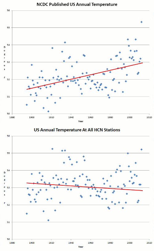
The following article from Marc Shepard of the American Thinker entitled: Climategate: CRU Was But The Tip Of The Iceberg looks in detail at the data sets created by the National Climate Data Centre (which is part of NOAA) and the NASA GISS data set GISTEMP which is administered by the grandfather of global warming James Hansen. As can be seen when looking at the following comparisons between the UAH satellite data set and firstly NCDC and the secondly GISTEMP there is considerable divergence between them because of the adjustments made by these organisations to their raw data. More detail on these graphs can be obtained here.


Marc Shepard explains:

Not surprisingly, the blatant corruption exposed at Britain’s premiere climate institute was not contained within the nation’s borders. Just months after the Climategate scandal broke, a new study has uncovered compelling evidence that our government
’s principal climate centers have also been manipulating worldwide temperature data in order to fraudulently advance the global warming political agenda.

Not only does the preliminary report [
PDF] indict a broader network of conspirators, but it also challenges the very mechanism by which global temperatures are measured, published, and historically ranked.

Last Thursday, Certified Consulting Meteorologist Joseph D’Aleo and computer expert E. Michael Smith appeared together on KUSI TV [Five Part Series Can Be Seen Via Here] to discuss the Climategate -- American Style scandal they had discovered. This time out, the alleged perpetrators are the National Oceanic and Atmospheric Administration (NOAA) and the NASA Goddard Institute for Space Studies (GISS).

NOAA stands accused by the two researchers of strategically deleting cherry-picked, cooler-reporting weather observation stations from the temperature data it provides the world through its National Climatic Data Center (NCDC). D’Aleo explained to show host and Weather Channel founder John Coleman that while the Hadley Center in the U.K. has been the subject of recent scrutiny, “[w]e think NOAA is complicit, if not the real ground zero for the issue.” And their primary accomplices are the scientists at GISS, who put the altered data through an even more biased regimen of alterations, including intentionally replacing the dropped NOAA readings with those of stations located in much warmer locales.

As you’ll soon see, the ultimate effects of these statistical transgressions on the reports which influence climate alarm and subsequently world energy policy are nothing short of staggering.

NOAA – Data In / Garbage Out

Although satellite temperature measurements have been available since 1978, most global temperature analyses still rely on data captured from land-based thermometers, scattered more or less about the planet. It is that data which NOAA receives and disseminates – although not before performing some sleight-of-hand on it.

Smith has done much of the heavy lifting involved in analyzing the NOAA/GISS data and software, and he chronicles his often frustrating experiences at his fascinating website. There, detail-seekers will find plenty to satisfy, divided into easily-navigated sections -- some designed specifically for us “geeks,” but most readily approachable to readers of all technical strata.

Perhaps the key point discovered by Smith was that by 1990, NOAA had deleted from its datasets all but 1,500 of the 6,000 thermometers in service around the globe.

Now, 75% represents quite a drop in sampling population, particularly considering that these stations provide the readings used to compile both the Global Historical Climatology Network (GHCN) and United States Historical Climatology Network (USHCN) datasets. These are the same datasets, incidentally, which serve as primary sources of temperature data not only for climate researchers and universities worldwide, but also for the many international agencies using the data to create analytical temperature anomaly maps and charts.

Yet as disturbing as the number of dropped stations was, it is the nature of NOAA’s “selection bias” that Smith found infinitely more troubling.

It seems that stations placed in historically cooler, rural areas of higher latitude and elevation were scrapped from the data series in favor of more urban locales at lower latitudes and elevations. Consequently, post-1990 readings have been biased to the warm side not only by selective geographic location, but also by the anthropogenic heating influence of a phenomenon known as the Urban Heat Island Effect (UHI).

For example, Canada’s reporting stations dropped from 496 in 1989 to 44 in 1991, with the percentage of stations at lower elevations tripling while the numbers of those at higher elevations dropped to one. That’s right: As Smith wrote in his blog, they left “one thermometer for everything north of LAT 65.” And that one resides in a place called Eureka, which has been described as “The Garden Spot of the Arctic” due to its unusually moderate summers.

Smith also discovered that in California, only four stations remain – one in San Francisco and three in Southern L.A. near the beach – and he rightly observed that

It is certainly impossible to compare it with the past record that had thermometers in the snowy mountains. So we can have no idea if California is warming or cooling by looking at the USHCN data set or the GHCN data set.

That’s because the baseline temperatures to which current readings are compared were a true averaging of both warmer and cooler locations. And comparing these historic true averages to contemporary false averages – which have had the lower end of their numbers intentionally stripped out – will always yield a warming trend, even when temperatures have actually dropped.

Overall, U.S. online stations have dropped from a peak of 1,850 in 1963 to a low of 136 as of 2007. In his blog, Smith wittily observed that “the Thermometer Langoliers have eaten 9/10 of the thermometers in the USA[,] including all the cold ones in California.” But he was deadly serious after comparing current to previous versions of USHCN data and discovering that this “selection bias” creates a +0.6°C warming in U.S. temperature history. And no wonder -- imagine the accuracy of campaign tracking polls were Gallup to include only the replies of Democrats in their statistics.

But it gets worse.


Prior to publication, NOAA effects a number of “adjustments” to the cherry-picked stations’ data, supposedly to eliminate flagrant outliers, adjust for time of day heat variance, and “homogenize” stations with their neighbors in order to compensate for discontinuities. This last one, they state, is accomplished by essentially adjusting each to jive closely with the mean of its five closest “neighbors.” But given the plummeting number of stations, and the likely disregard for the latitude, elevation, or UHI of such neighbors, it’s no surprise that such “homogenizing” seems to always result in warmer readings.

The chart below is from Willis Eschenbach’s WUWT essay, “The smoking gun at Darwin Zero,” and it plots GHCN Raw versus homogeneity-adjusted temperature data at Darwin International Airport in Australia. The “adjustments” actually reversed the 20th-century trend from temperatures falling at 0.7°C per century to temperatures rising at 1.2°C per century.
Eschenbach isolated a single station and found that it was adjusted to the positive by 6.0°C per century, and with no apparent reason, as all five stations at the airport more or less aligned for each period. His conclusion was that he had uncovered “indisputable evidence that the ‘homogenized’ data has been changed to fit someone’s preconceptions about whether the earth is warming.”


WUWT’s editor, Anthony Watts, has calculated the overall U.S. homogeneity bias to be 0.5°F to the positive, which alone accounts for almost one half of the 1.2°F warming over the last century. Add Smith’s selection bias to the mix and poof – actual warming completely disappears!

Yet believe it or not, the manipulation does not stop there.

GISS – Garbage In / Globaloney Out

The scientists at NASA’s GISS are widely considered to be the world’s leading researchers into atmospheric and climate changes. And their Surface Temperature (GISTemp) analysis system is undoubtedly the premiere source for global surface temperature anomaly reports. In creating its widely disseminated maps and charts, the program merges station readings collected from the Scientific Committee on Antarctic Research (SCAR)
with GHCN and USHCN data from NOAA.

It then puts the merged data through a few “adjustments” of its own.

First, it further “homogenizes” stations, supposedly adjusting for UHI by (according to NASA) changing “the long term trend of any non-rural station to match the long term trend of their rural neighbors, while retaining the short term monthly and annual variations.” Of course, the reduced number of stations will have the same effect on GISS’s UHI correction as it did on NOAA’s discontinuity homogenization – the creation of artificial warming.

Furthermore, in his communications with me, Smith cited boatloads of problems and errors he found in the Fortran code written to accomplish this task, ranging from hot airport stations being mismarked as “rural” to the “correction” having the wrong sign (+/-) and therefore increasing when it meant to decrease or vice-versa.

And according to NASA, “If no such neighbors exist or the overlap of the rural combination and the non-rural record is less than 20 years, the station is completely dropped; if the rural records are shorter, part of the non-rural record is dropped.”

However, Smith points out that a dropped record may be “from a location that has existed for 100 years.” For instance, if an aging piece of equipment gets swapped out, thereby changing its identification number, the time horizon reinitializes to zero years. Even having a large enough temporal gap (e.g., during a world war) might cause the data to “just get tossed out.” But the real chicanery begins in the next phase, wherein the planet is flattened and stretched onto an 8,000-box grid, into which the time series are converted to a series of anomalies (degree variances from the baseline). Now, you might wonder just how one manages to fill 8,000 boxes using 1,500 stations.

Here’s NASA’s solution:
For each grid box, the stations within that grid box and also any station within 1200km of the center of that box are combined using the reference station method.

Even on paper, the design flaws inherent in such a process should be glaringly obvious. So it’s no surprise that Smith found many examples of problems surfacing in actual practice. He offered me Hawaii for starters. It seems that all of the Aloha State’s surviving stations reside in major airports. Nonetheless, this unrepresentative hot data is what’s used to “infill” the surrounding “empty” Grid Boxes up to 1200 km out to sea. So in effect, you have “jet airport tarmacs ‘standing in’ for temperature over water 1200 km closer to the North Pole.”

An isolated problem? Hardly, reports Smith.

From KUSI’s Global Warming: The Other Side:
“There’s a wonderful baseline for Bolivia -- a very high mountainous country -- right up until 1990 when the data ends. And if you look on the [GISS] November 2009 anomaly map, you’ll see a very red rosy hot Bolivia [boxed in blue]. But how do you get a hot Bolivia when you haven’t measured the temperature for 20 years?”

Of course, you already know the answer: GISS simply fills in the missing numbers – originally cool, as Bolivia contains proportionately more land above 10,000 feet than any other country in the world
– with hot ones available in neighboring stations on a beach in Peru or somewhere in the Amazon jungle.

Remember that single station north of 65° latitude which they located in a warm section of northern Canada? Joe D’Aleo explained its purpose: “To estimate temperatures in the Northwest Territory [boxed in green above], they either have to rely on that location or look further south.”

Pretty slick, huh?

And those are but a few examples. In fact, throughout the entire grid, cooler station data are dropped and “filled in” by temperatures extrapolated from warmer stations in a manner obviously designed to overestimate warming...

...And convince you that it’s your fault.

Government and Intergovernmental Agencies -- Globaloney In / Green Gospel Out

Smith attributes up to 3°F (more in some places) of added “warming trend” between NOAA’s data adjustment and GIStemp processing.

That’s over twice last century’s reported warming.

And yet, not only are NOAA’s bogus data accepted as green gospel, but so are its equally bogus hysterical claims, like this one from the 2006 annual State of the Climate in 2005 [PDF]: “Globally averaged mean annual air temperature in 2005 slightly exceeded the previous record heat of 1998, making 2005 the warmest year on record.”

And as D’Aleo points out in the preliminary report, the recent NOAA proclamation that June 2009 was the second-warmest June in 130 years will go down in the history books, despite multiple satellite assessments ranking it as the 15th-coldest in 31 years.

Even when our own National Weather Service (NWS) makes its frequent announcements that a certain month or year was the hottest ever, or that five of the warmest years on record occurred last decade, they’re basing such hyperbole entirely on NOAA’s warm-biased data. And how can anyone possibly read GISS chief James Hansen’s Sunday claim that 2009 was tied with 2007 for second-warmest year overall, and the Southern Hemisphere’s absolute warmest in 130 years of global instrumental temperature records, without laughing hysterically? It's especially laughable when one considers that NOAA had just released a statement claiming that very same year (2009) to be tied with 2006 for the fifth-warmest year on record.

So how do alarmists reconcile one government center reporting 2009 as tied for second while another had it tied for fifth? If you’re WaPo’s Andrew Freedman, you simply chalk it up to “different data analysis methods” before adjudicating both NASA and NOAA innocent of any impropriety based solely on their pointless assertions that they didn’t do it.

Earth to Andrew: “Different data analysis methods”? Try replacing “analysis” with “manipulation,” and ye shall find enlightenment. More importantly, does the explicit fact that since the drastically divergent results of both “methods” can’t be right, both are immediately suspect somehow elude you?

But by far the most significant impact of this data fraud is that it ultimately bubbles up to the pages of the climate alarmists’ bible: The United Nations Intergovernmental Panel on Climate Change Assessment Report.

And wrong data begets wrong reports, which – particularly in this case – begets dreadfully wrong policy.

It’s High Time We Investigated the Investigators

The final report will be made public shortly, and it will be available at the websites of both report-supporter Science and Public Policy Institute and Joe D’Aleo’s own ICECAP. As they’ve both been tremendously helpful over the past few days, I’ll trust in the opinions I’ve received from the report’s architects to sum up.

This from the meteorologist:
The biggest gaps and greatest uncertainties are in high latitude areas where the data centers say they 'find' the greatest warming (and thus which contribute the most to their global anomalies). Add to that no adjustment for urban growth and land use changes (even as the world's population increased from 1.5 to 6.7 billion people) [in the NOAA data] and questionable methodology for computing the historical record that very often cools off the early record and you have surface based data sets so seriously flawed, they can no longer be trusted for climate trend or model forecast assessment or decision making by the administration, congress or the EPA.

Roger Pielke Sr. has suggested: “...that we move forward with an inclusive assessment of the surface temperature record of CRU, GISS and NCDC. We need to focus on the science issues. This necessarily should involve all research investigators who are working on this topic, with formal assessments chaired and paneled by mutually agreed to climate scientists who do not have a vested interest in the outcome of the evaluations.” I endorse that suggestion.
Certainly, all rational thinkers agree. Perhaps even the mainstream media, most of whom have hitherto mistakenly dismissed Climategate as a uniquely British problem, will now wake up and demand such an investigation.

And this from the computer expert:
That the bias exists is not denied. That the data are too sparse and with too many holes over time in not denied. Temperature series programs, like NASA GISS GIStemp try, but fail, to fix the holes and the bias. What is claimed is that "the anomaly will fix it." But it cannot. Comparison of a cold baseline set to a hot present set must create a biased anomaly. It is simply overwhelmed by the task of taking out that much bias. And yet there is more. A whole zoo of adjustments are made to the data. These might be valid in some cases, but the end result is to put in a warming trend of up to several degrees. We are supposed to panic over a 1/10 degree change of "anomaly" but accept 3 degrees of "adjustment" with no worries at all. To accept that GISTemp is "a perfect filter". That is, simply, "nuts". It was a good enough answer at Bastogne, and applies here too.
Smith, who had a family member attached to the 101st Airborne at the time, refers to the famous line from the 101st commander, U.S. Army General Anthony Clement McAuliffe, who replied to a German ultimatum to surrender the December, 1944 Battle of Bastogne, Belgium with a single word: “Nuts.”

And that’s exactly what we’d be were we to surrender our freedoms, our economic growth, and even our simplest comforts to duplicitous zealots before checking and double-checking the work of the prophets predicting our doom should we refuse.

Further analysis of the Bolivia and Arctic GISTemp effects can be seen
here.

So as we can see amongst the warmist data sets, the tendancy to "adjust their data" is commonplace. The adjustments are invariably up in nature. It explains the graphs.