


Yet when we compare the UAH satellite based data set with the CRU linked HadCRUT series we immediately notice a divergence between the two with the HadCRUT series showing more warming. This is because HadCRUT "adjust" their raw data.

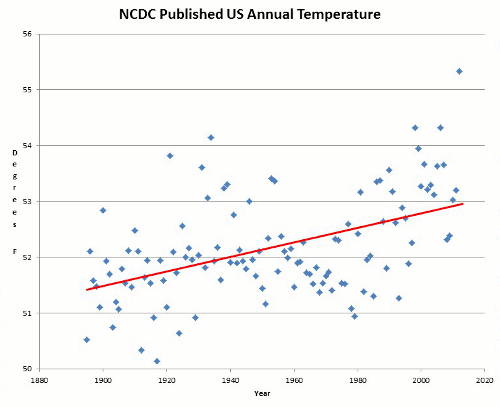
The following article from Marc Shepard of the American Thinker entitled: Climategate: CRU Was But The Tip Of The Iceberg looks in detail at the data sets created by the National Climate Data Centre (which is part of NOAA) and the NASA GISS data set GISTEMP which is administered by the grandfather of global warming James Hansen. As can be seen when looking at the following comparisons between the UAH satellite data set and firstly NCDC and the secondly GISTEMP there is considerable divergence between them because of the adjustments made by these organisations to their raw data. More detail on these graphs can be obtained here.


Marc Shepard explains:
Not surprisingly, the blatant corruption exposed at Britain’s premiere climate institute was not contained within the nation’s borders. Just months after the Climategate scandal broke, a new study has uncovered compelling evidence that our government’s principal climate centers have also been manipulating worldwide temperature data in order to fraudulently advance the global warming political agenda.
Not surprisingly, the blatant corruption exposed at Britain’s premiere climate institute was not contained within the nation’s borders. Just months after the Climategate scandal broke, a new study has uncovered compelling evidence that our government’s principal climate centers have also been manipulating worldwide temperature data in order to fraudulently advance the global warming political agenda.
Not only does the preliminary report [PDF] indict a broader network of conspirators, but it also challenges the very mechanism by which global temperatures are measured, published, and historically ranked.
Last Thursday, Certified Consulting Meteorologist Joseph D’Aleo and computer expert E. Michael Smith appeared together on KUSI TV [Five Part Series Can Be Seen Via Here] to discuss the Climategate -- American Style scandal they had discovered. This time out, the alleged perpetrators are the National Oceanic and Atmospheric Administration (NOAA) and the NASA Goddard Institute for Space Studies (GISS).
NOAA stands accused by the two researchers of strategically deleting cherry-picked, cooler-reporting weather observation stations from the temperature data it provides the world through its National Climatic Data Center (NCDC). D’Aleo explained to show host and Weather Channel founder John Coleman that while the Hadley Center in the U.K. has been the subject of recent scrutiny, “[w]e think NOAA is complicit, if not the real ground zero for the issue.” And their primary accomplices are the scientists at GISS, who put the altered data through an even more biased regimen of alterations, including intentionally replacing the dropped NOAA readings with those of stations located in much warmer locales.
As you’ll soon see, the ultimate effects of these statistical transgressions on the reports which influence climate alarm and subsequently world energy policy are nothing short of staggering.
NOAA – Data In / Garbage Out
Although satellite temperature measurements have been available since 1978, most global temperature analyses still rely on data captured from land-based thermometers, scattered more or less about the planet. It is that data which NOAA receives and disseminates – although not before performing some sleight-of-hand on it.
Smith has done much of the heavy lifting involved in analyzing the NOAA/GISS data and software, and he chronicles his often frustrating experiences at his fascinating website. There, detail-seekers will find plenty to satisfy, divided into easily-navigated sections -- some designed specifically for us “geeks,” but most readily approachable to readers of all technical strata.
Perhaps the key point discovered by Smith was that by 1990, NOAA had deleted from its datasets all but 1,500 of the 6,000 thermometers in service around the globe.
Now, 75% represents quite a drop in sampling population, particularly considering that these stations provide the readings used to compile both the Global Historical Climatology Network (GHCN) and United States Historical Climatology Network (USHCN) datasets. These are the same datasets, incidentally, which serve as primary sources of temperature data not only for climate researchers and universities worldwide, but also for the many international agencies using the data to create analytical temperature anomaly maps and charts.
Yet as disturbing as the number of dropped stations was, it is the nature of NOAA’s “selection bias” that Smith found infinitely more troubling.
It seems that stations placed in historically cooler, rural areas of higher latitude and elevation were scrapped from the data series in favor of more urban locales at lower latitudes and elevations. Consequently, post-1990 readings have been biased to the warm side not only by selective geographic location, but also by the anthropogenic heating influence of a phenomenon known as the Urban Heat Island Effect (UHI).
For example, Canada’s reporting stations dropped from 496 in 1989 to 44 in 1991, with the percentage of stations at lower elevations tripling while the numbers of those at higher elevations dropped to one. That’s right: As Smith wrote in his blog, they left “one thermometer for everything north of LAT 65.” And that one resides in a place called Eureka, which has been described as “The Garden Spot of the Arctic” due to its unusually moderate summers.
Smith also discovered that in California, only four stations remain – one in San Francisco and three in Southern L.A. near the beach – and he rightly observed that
It is certainly impossible to compare it with the past record that had thermometers in the snowy mountains. So we can have no idea if California is warming or cooling by looking at the USHCN data set or the GHCN data set.
That’s because the baseline temperatures to which current readings are compared were a true averaging of both warmer and cooler locations. And comparing these historic true averages to contemporary false averages – which have had the lower end of their numbers intentionally stripped out – will always yield a warming trend, even when temperatures have actually dropped.
Overall, U.S. online stations have dropped from a peak of 1,850 in 1963 to a low of 136 as of 2007. In his blog, Smith wittily observed that “the Thermometer Langoliers have eaten 9/10 of the thermometers in the USA[,] including all the cold ones in California.” But he was deadly serious after comparing current to previous versions of USHCN data and discovering that this “selection bias” creates a +0.6°C warming in U.S. temperature history. And no wonder -- imagine the accuracy of campaign tracking polls were Gallup to include only the replies of Democrats in their statistics.
But it gets worse.
But it gets worse.
Prior to publication, NOAA effects a number of “adjustments” to the cherry-picked stations’ data, supposedly to eliminate flagrant outliers, adjust for time of day heat variance, and “homogenize” stations with their neighbors in order to compensate for discontinuities. This last one, they state, is accomplished by essentially adjusting each to jive closely with the mean of its five closest “neighbors.” But given the plummeting number of stations, and the likely disregard for the latitude, elevation, or UHI of such neighbors, it’s no surprise that such “homogenizing” seems to always result in warmer readings.
The chart below is from Willis Eschenbach’s WUWT essay, “The smoking gun at Darwin Zero,” and it plots GHCN Raw versus homogeneity-adjusted temperature data at Darwin International Airport in Australia. The “adjustments” actually reversed the 20th-century trend from temperatures falling at 0.7°C per century to temperatures rising at 1.2°C per century. Eschenbach isolated a single station and found that it was adjusted to the positive by 6.0°C per century, and with no apparent reason, as all five stations at the airport more or less aligned for each period. His conclusion was that he had uncovered “indisputable evidence that the ‘homogenized’ data has been changed to fit someone’s preconceptions about whether the earth is warming.”

WUWT’s editor, Anthony Watts, has calculated the overall U.S. homogeneity bias to be 0.5°F to the positive, which alone accounts for almost one half of the 1.2°F warming over the last century. Add Smith’s selection bias to the mix and poof – actual warming completely disappears!
Yet believe it or not, the manipulation does not stop there.
Yet believe it or not, the manipulation does not stop there.
GISS – Garbage In / Globaloney Out
The scientists at NASA’s GISS are widely considered to be the world’s leading researchers into atmospheric and climate changes. And their Surface Temperature (GISTemp) analysis system is undoubtedly the premiere source for global surface temperature anomaly reports. In creating its widely disseminated maps and charts, the program merges station readings collected from the Scientific Committee on Antarctic Research (SCAR) with GHCN and USHCN data from NOAA.
It then puts the merged data through a few “adjustments” of its own.
First, it further “homogenizes” stations, supposedly adjusting for UHI by (according to NASA) changing “the long term trend of any non-rural station to match the long term trend of their rural neighbors, while retaining the short term monthly and annual variations.” Of course, the reduced number of stations will have the same effect on GISS’s UHI correction as it did on NOAA’s discontinuity homogenization – the creation of artificial warming.
Furthermore, in his communications with me, Smith cited boatloads of problems and errors he found in the Fortran code written to accomplish this task, ranging from hot airport stations being mismarked as “rural” to the “correction” having the wrong sign (+/-) and therefore increasing when it meant to decrease or vice-versa.
And according to NASA, “If no such neighbors exist or the overlap of the rural combination and the non-rural record is less than 20 years, the station is completely dropped; if the rural records are shorter, part of the non-rural record is dropped.”
However, Smith points out that a dropped record may be “from a location that has existed for 100 years.” For instance, if an aging piece of equipment gets swapped out, thereby changing its identification number, the time horizon reinitializes to zero years. Even having a large enough temporal gap (e.g., during a world war) might cause the data to “just get tossed out.” But the real chicanery begins in the next phase, wherein the planet is flattened and stretched onto an 8,000-box grid, into which the time series are converted to a series of anomalies (degree variances from the baseline). Now, you might wonder just how one manages to fill 8,000 boxes using 1,500 stations.
Here’s NASA’s solution:
For each grid box, the stations within that grid box and also any station within 1200km of the center of that box are combined using the reference station method.
Even on paper, the design flaws inherent in such a process should be glaringly obvious. So it’s no surprise that Smith found many examples of problems surfacing in actual practice. He offered me Hawaii for starters. It seems that all of the Aloha State’s surviving stations reside in major airports. Nonetheless, this unrepresentative hot data is what’s used to “infill” the surrounding “empty” Grid Boxes up to 1200 km out to sea. So in effect, you have “jet airport tarmacs ‘standing in’ for temperature over water 1200 km closer to the North Pole.”
An isolated problem? Hardly, reports Smith.
From KUSI’s Global Warming: The Other Side:
“There’s a wonderful baseline for Bolivia -- a very high mountainous country -- right up until 1990 when the data ends. And if you look on the [GISS] November 2009 anomaly map, you’ll see a very red rosy hot Bolivia [boxed in blue]. But how do you get a hot Bolivia when you haven’t measured the temperature for 20 years?”

Of course, you already know the answer: GISS simply fills in the missing numbers – originally cool, as Bolivia contains proportionately more land above 10,000 feet than any other country in the world – with hot ones available in neighboring stations on a beach in Peru or somewhere in the Amazon jungle.
Remember that single station north of 65° latitude which they located in a warm section of northern Canada? Joe D’Aleo explained its purpose: “To estimate temperatures in the Northwest Territory [boxed in green above], they either have to rely on that location or look further south.”
Pretty slick, huh?
And those are but a few examples. In fact, throughout the entire grid, cooler station data are dropped and “filled in” by temperatures extrapolated from warmer stations in a manner obviously designed to overestimate warming...
...And convince you that it’s your fault.
Government and Intergovernmental Agencies -- Globaloney In / Green Gospel Out
Smith attributes up to 3°F (more in some places) of added “warming trend” between NOAA’s data adjustment and GIStemp processing.
That’s over twice last century’s reported warming.
And yet, not only are NOAA’s bogus data accepted as green gospel, but so are its equally bogus hysterical claims, like this one from the 2006 annual State of the Climate in 2005 [PDF]: “Globally averaged mean annual air temperature in 2005 slightly exceeded the previous record heat of 1998, making 2005 the warmest year on record.”
And as D’Aleo points out in the preliminary report, the recent NOAA proclamation that June 2009 was the second-warmest June in 130 years will go down in the history books, despite multiple satellite assessments ranking it as the 15th-coldest in 31 years.
Even when our own National Weather Service (NWS) makes its frequent announcements that a certain month or year was the hottest ever, or that five of the warmest years on record occurred last decade, they’re basing such hyperbole entirely on NOAA’s warm-biased data. And how can anyone possibly read GISS chief James Hansen’s Sunday claim that 2009 was tied with 2007 for second-warmest year overall, and the Southern Hemisphere’s absolute warmest in 130 years of global instrumental temperature records, without laughing hysterically? It's especially laughable when one considers that NOAA had just released a statement claiming that very same year (2009) to be tied with 2006 for the fifth-warmest year on record.
So how do alarmists reconcile one government center reporting 2009 as tied for second while another had it tied for fifth? If you’re WaPo’s Andrew Freedman, you simply chalk it up to “different data analysis methods” before adjudicating both NASA and NOAA innocent of any impropriety based solely on their pointless assertions that they didn’t do it.
Earth to Andrew: “Different data analysis methods”? Try replacing “analysis” with “manipulation,” and ye shall find enlightenment. More importantly, does the explicit fact that since the drastically divergent results of both “methods” can’t be right, both are immediately suspect somehow elude you?
But by far the most significant impact of this data fraud is that it ultimately bubbles up to the pages of the climate alarmists’ bible: The United Nations Intergovernmental Panel on Climate Change Assessment Report.
And wrong data begets wrong reports, which – particularly in this case – begets dreadfully wrong policy.
It’s High Time We Investigated the Investigators
The final report will be made public shortly, and it will be available at the websites of both report-supporter Science and Public Policy Institute and Joe D’Aleo’s own ICECAP. As they’ve both been tremendously helpful over the past few days, I’ll trust in the opinions I’ve received from the report’s architects to sum up.
This from the meteorologist:
The biggest gaps and greatest uncertainties are in high latitude areas where the data centers say they 'find' the greatest warming (and thus which contribute the most to their global anomalies). Add to that no adjustment for urban growth and land use changes (even as the world's population increased from 1.5 to 6.7 billion people) [in the NOAA data] and questionable methodology for computing the historical record that very often cools off the early record and you have surface based data sets so seriously flawed, they can no longer be trusted for climate trend or model forecast assessment or decision making by the administration, congress or the EPA.Roger Pielke Sr. has suggested: “...that we move forward with an inclusive assessment of the surface temperature record of CRU, GISS and NCDC. We need to focus on the science issues. This necessarily should involve all research investigators who are working on this topic, with formal assessments chaired and paneled by mutually agreed to climate scientists who do not have a vested interest in the outcome of the evaluations.” I endorse that suggestion.
Certainly, all rational thinkers agree. Perhaps even the mainstream media, most of whom have hitherto mistakenly dismissed Climategate as a uniquely British problem, will now wake up and demand such an investigation.
And this from the computer expert:
That the bias exists is not denied. That the data are too sparse and with too many holes over time in not denied. Temperature series programs, like NASA GISS GIStemp try, but fail, to fix the holes and the bias. What is claimed is that "the anomaly will fix it." But it cannot. Comparison of a cold baseline set to a hot present set must create a biased anomaly. It is simply overwhelmed by the task of taking out that much bias. And yet there is more. A whole zoo of adjustments are made to the data. These might be valid in some cases, but the end result is to put in a warming trend of up to several degrees. We are supposed to panic over a 1/10 degree change of "anomaly" but accept 3 degrees of "adjustment" with no worries at all. To accept that GISTemp is "a perfect filter". That is, simply, "nuts". It was a good enough answer at Bastogne, and applies here too.
Smith, who had a family member attached to the 101st Airborne at the time, refers to the famous line from the 101st commander, U.S. Army General Anthony Clement McAuliffe, who replied to a German ultimatum to surrender the December, 1944 Battle of Bastogne, Belgium with a single word: “Nuts.”
And that’s exactly what we’d be were we to surrender our freedoms, our economic growth, and even our simplest comforts to duplicitous zealots before checking and double-checking the work of the prophets predicting our doom should we refuse.
Further analysis of the Bolivia and Arctic GISTemp effects can be seen here.
So as we can see amongst the warmist data sets, the tendancy to "adjust their data" is commonplace. The adjustments are invariably up in nature. It explains the graphs.
No comments:
Post a Comment