People keep saying “Yes, the Climategate scientists behaved badly. But that doesn’t mean the data is bad. That doesn’t mean the earth is not warming.”
Let me start with the second objection first. The earth has generally been warming since the Little Ice Age, around 1650. There is general agreement that the earth has warmed since then. See e.g. Akasofu . Climategate doesn’t affect that.
The second question, the integrity of the data, is different. People say “Yes, they destroyed emails, and hid from Freedom of information Acts, and messed with proxies, and fought to keep other scientists’ papers out of the journals … but that doesn’t affect the data, the data is still good.” Which sounds reasonable.
There are three main global temperature datasets. One is at the CRU, Climate Research Unit of the University of East Anglia, where we’ve been trying to get access to the raw numbers. One is at NOAA/GHCN, the Global Historical Climate Network. The final one is at NASA/GISS, the Goddard Institute for Space Studies. The three groups take raw data, and they “homogenize” it to remove things like when a station was moved to a warmer location and there’s a 2C jump in the temperature. The three global temperature records are usually called CRU, GISS, and GHCN. Both GISS and CRU, however, get almost all of their raw data from GHCN. All three produce very similar global historical temperature records from the raw data.
So I’m still on my multi-year quest to understand the climate data. You never know where this data chase will lead. This time, it has ended me up in Australia. I got to thinking about Professor Wibjorn Karlen’s statement about Australia that I quoted here:
Another example is Australia. NASA [GHCN] only presents 3 stations covering the period 1897-1992. What kind of data is the IPCC Australia diagram based on?
If any trend it is a slight cooling. However, if a shorter period (1949-2005) is used, the temperature has increased substantially. The Australians have many stations and have published more detailed maps of changes and trends.
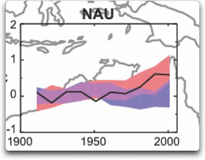
The folks at CRU told Wibjorn that he was just plain wrong. Here’s what they said is right, the record that Wibjorn was talking about, Fig. 9.12 in the UN IPCC Fourth Assessment Report, showing Northern Australia:
Figure 1. Temperature trends and model results in Northern Australia. Black line is observations (From Fig. 9.12 from the UN IPCC Fourth Annual Report). Covers the area from 110E to 155E, and from 30S to 11S. Based on the CRU land temperature.) Data from the CRU.
One of the things that was revealed in the released CRU emails is that the CRU basically uses the Global Historical Climate Network (GHCN) dataset for its raw data. So I looked at the GHCN dataset. There, I find three stations in North Australia as Wibjorn had said, and nine stations in all of Australia, that cover the period 1900-2000. Here is the average of the GHCN unadjusted data for those three Northern stations, from AIS:
Figure 2. GHCN Raw Data, All 100-yr stations in IPCC area above.
So once again Wibjorn is correct, this looks nothing like the corresponding IPCC temperature record for Australia. But it’s too soon to tell. Professor Karlen is only showing 3 stations. Three is not a lot of stations, but that’s all of the century-long Australian records we have in the IPCC specified region. OK, we’ve seen the longest stations record, so lets throw more records into the mix. Here’s every station in the UN IPCC specified region which contains temperature records that extend up to the year 2000 no matter when they started, which is 30 stations.
Figure 3. GHCN Raw Data, All stations extending to 2000 in IPCC area above.
Still no similarity with IPCC. So I looked at every station in the area. That’s 222 stations. Here’s that result:
Figure 4. GHCN Raw Data, All stations extending to 2000 in IPCC area above.
So you can see why Wibjorn was concerned. This looks nothing like the UN IPCC data, which came from the CRU, which was based on the GHCN data. Why the difference?
The answer is, these graphs all use the raw GHCN data. But the IPCC uses the “adjusted” data. GHCN adjusts the data to remove what it calls “inhomogeneities”. So on a whim I thought I’d take a look at the first station on the list, Darwin Airport, so I could see what an inhomogeneity might look like when it was at home. And I could find out how large the GHCN adjustment for Darwin inhomogeneities was.
First, what is an “inhomogeneity”? I can do no better than quote from GHCN:
Most long-term climate stations have undergone changes that make a time series of their observations inhomogeneous. There are many causes for the discontinuities, including changes in instruments, shelters, the environment around the shelter, the location of the station, the time of observation, and the method used to calculate mean temperature. Often several of these occur at the same time, as is often the case with the introduction of automatic weather stations that is occurring in many parts of the world. Before one can reliably use such climate data for analysis of longterm climate change, adjustments are needed to compensate for the nonclimatic discontinuities.
That makes sense. The raw data will have jumps from station moves and the like. We don’t want to think it’s warming just because the thermometer was moved to a warmer location. Unpleasant as it may seem, we have to adjust for those as best we can.
I always like to start with the rawest data, so I can understand the adjustments. At Darwin there are five separate individual station records that are combined to make up the final Darwin record. These are the individual records of stations in the area, which are numbered from zero to four:
DATA SOURCE: http://data.giss.nasa.gov/cgi-bin/gistemp/findstation.py?datatype=gistemp&data_set=0&name=darwin
Figure 5. Five individual temperature records for Darwin, plus station count (green line). This raw data is downloaded from GISS, but GISS use the GHCN raw data as the starting point for their analysis.
Darwin does have a few advantages over other stations with multiple records. There is a continuous record from 1941 to the present (Station 1). There is also a continuous record covering a century. finally, the stations are in very close agreement over the entire period of the record. In fact, where there are multiple stations in operation they are so close that you can’t see the records behind Station Zero.
This is an ideal station, because it also illustrates many of the problems with the raw temperature station data.
- There is no one record that covers the whole period.
- The shortest record is only nine years long.
- There are gaps of a month and more in almost all of the records.
- It looks like there are problems with the data at around 1941.
- Most of the datasets are missing months.
- For most of the period there are few nearby stations.
- There is no one year covered by all five records.
- The temperature dropped over a six year period, from a high in 1936 to a low in 1941. The station did move in 1941 … but what happened in the previous six years?
In resolving station records, it’s a judgment call. First off, you have to decide if what you are looking at needs any changes at all. In Darwin’s case, it’s a close call. The record seems to be screwed up around 1941, but not in the year of the move.
Also, although the 1941 temperature shift seems large, I see a similar sized shift from 1992 to 1999. Looking at the whole picture, I think I’d vote to leave it as it is, that’s always the best option when you don’t have other evidence. First do no harm.
However, there’s a case to be made for adjusting it, particularly given the 1941 station move. If I decided to adjust Darwin, I’d do it like this:
Figure 6 A possible adjustment for Darwin. Black line shows the total amount of the adjustment, on the right scale, and shows the timing of the change.
I shifted the pre-1941 data down by about 0.6C. We end up with little change end to end in my “adjusted” data (shown in red), it’s neither warming nor cooling. However, it reduces the apparent cooling in the raw data. Post-1941, where the other records overlap, they are very close, so I wouldn’t adjust them in any way. Why should we adjust those, they all show exactly the same thing.
OK, so that’s how I’d homogenize the data if I had to, but I vote against adjusting it at all. It only changes one station record (Darwin Zero), and the rest are left untouched.
Then I went to look at what happens when the GHCN removes the “in-homogeneities” to “adjust” the data. Of the five raw datasets, the GHCN discards two, likely because they are short and duplicate existing longer records. The three remaining records are first “homogenized” and then averaged to give the “GHCN Adjusted” temperature record for Darwin.
To my great surprise, here’s what I found. To explain the full effect, I am showing this with both datasets starting at the same point (rather than ending at the same point as they are often shown).
Figure 7. GHCN homogeneity adjustments to Darwin Airport combined record
YIKES! Before getting homogenized, temperatures in Darwin were falling at 0.7 Celcius per century … but after the homogenization, they were warming at 1.2 Celcius per century. And the adjustment that they made was over two degrees per century … when those guys “adjust”, they don’t mess around. And the adjustment is an odd shape, with the adjustment first going stepwise, then climbing roughly to stop at 2.4C.
Of course, that led me to look at exactly how the GHCN “adjusts” the temperature data. Here’s what they say in An Overview of the GHCN Database:
GHCN temperature data include two different datasets: the original data and a homogeneity- adjusted dataset. All homogeneity testing was done on annual time series. The homogeneity- adjustment technique used two steps.
The first step was creating a homogeneous reference series for each station (Peterson and Easterling 1994). Building a completely homogeneous reference series using data with unknown inhomogeneities may be impossible, but we used several techniques to minimize any potential inhomogeneities in the reference series.
…
In creating each year’s first difference reference series, we used the five most highly correlated neighboring stations that had enough data to accurately model the candidate station.
…
The final technique we used to minimize inhomogeneities in the reference series used the mean of the central three values (of the five neighboring station values) to create the first difference reference series.
Fair enough, that all sounds good. They pick five neighboring stations, and average them. Then they compare the average to the station in question. If it looks wonky compared to the average of the reference five, they check any historical records for changes, and if necessary, they homogenize the poor data mercilessly. I have some problems with what they do to homogenize it, but that’s how they identify the inhomogeneous stations.
OK … but given the scarcity of stations in Australia, I wondered how they would find five “neighboring stations” in 1941 …
So I looked it up. The nearest station that covers the year 1941 is 500 km away from Darwin. Not only is it 500 km away, it is the only station within 750 km of Darwin that covers the 1941 time period. (It’s also a pub, Daly Waters Pub to be exact, but hey, it’s Australia, good on ya.) So there simply aren’t five stations to make a “reference series” out of to check the 1936-1941 drop at Darwin.
Intrigued by the curious shape of the average of the homogenized Darwin records, I then went to see how they had homogenized each of the individual station records. What made up that strange average shown in Fig. 7? I started at zero with the earliest record. Here is Station Zero at Darwin, showing the raw and the homogenized versions.
Figure 8 Darwin Zero Homogeneity Adjustments. Black line shows amount and timing of adjustments.
Yikes again, double yikes! What on earth justifies that adjustment? How can they do that? We have five different records covering Darwin from 1941 on. They all agree almost exactly. Why adjust them at all? They’ve just added a huge artificial totally imaginary trend to the last half of the raw data! Now it looks like the IPCC diagram in Figure 1, all right … but a six degree per century trend? And in the shape of a regular stepped pyramid climbing to heaven? What’s up with that?
Those, dear friends, are the clumsy fingerprints of someone messing with the data Egyptian style … they are indisputable evidence that the “homogenized” data has been changed to fit someone’s preconceptions about whether the earth is warming.
One thing is clear from this. People who say that “Climategate was only about scientists behaving badly, but the data is OK” are wrong. At least one part of the data is bad, too. The Smoking Gun for that statement is at Darwin Zero.
So once again, I’m left with an unsolved mystery. How and why did the GHCN “adjust” Darwin’s historical temperature to show radical warming? Why did they adjust it stepwise? Do Phil Jones and the CRU folks use the “adjusted” or the raw GHCN dataset? My guess is the adjusted one since it shows warming, but of course we still don’t know … because despite all of this, the CRU still hasn’t released the list of data that they actually use, just the station list.
Another odd fact, the GHCN adjusted Station 1 to match Darwin Zero’s strange adjustment, but they left Station 2 (which covers much of the same period, and as per Fig. 5 is in excellent agreement with Station Zero and Station 1) totally untouched. They only homogenized two of the three. Then they averaged them.
That way, you get an average that looks kinda real, I guess, it “hides the decline”.
Oh, and for what it’s worth, care to know the way that GISS deals with this problem? Well, they only use the Darwin data after 1963, a fine way of neatly avoiding the question … and also a fine way to throw away all of the inconveniently colder data prior to 1941. It’s likely a better choice than the GHCN monstrosity, but it’s a hard one to justify.
Now, I want to be clear here. The blatantly bogus GHCN adjustment for this one station does NOT mean that the earth is not warming. It also does NOT mean that the three records (CRU, GISS, and GHCN) are generally wrong either. This may be an isolated incident, we don’t know. But every time the data gets revised and homogenized, the trends keep increasing. Now GISS does their own adjustments. However, as they keep telling us, they get the same answer as GHCN gets … which makes their numbers suspicious as well.
And CRU? Who knows what they use? We’re still waiting on that one, no data yet …
What this does show is that there is at least one temperature station where the trend has been artificially increased to give a false warming where the raw data shows cooling. In addition, the average raw data for Northern Australia is quite different from the adjusted, so there must be a number of … mmm … let me say “interesting” adjustments in Northern Australia other than just Darwin.
And with the Latin saying “Falsus in unum, falsus in omis” (false in one, false in all) as our guide, until all of the station “adjustments” are examined, adjustments of CRU, GHCN, and GISS alike, we can’t trust anyone using homogenized numbers.
It would seem that the influence of the CRU and it's preference for adjusting data wasn't restricted to the Southern Hemisphere. As I will show in the subsequent posts on this topic.


No comments:
Post a Comment