


New Zealand’s National Institute of Water & Atmospheric Research (NIWA) is responsible for New Zealand’s National Climate Database. This database, available online, holds all New Zealand’s climate data, including temperature readings, since the 1850s. Anybody can go and get the data for free. That’s what we did, and we made our own graph. Before we see that, let’s look at the official temperature record. This is NIWA’s graph of temperatures covering the last 156 years: From NIWA’s web site -

Mean annual temperature over New Zealand, from 1853 to 2008 inclusive, based on between 2 (from 1853) and 7 (from 1908) long-term station records. The blue and red bars show annual differences from the 1971 - 2000 average, the solid black line is a smoothed time series, and the dotted [straight] line is the linear trend over 1909 to 2008 (0.92C/100 years).
This graph is the centrepiece of NIWA’s temperature claims. It contributes to global temperature statistics and the IPCC reports. It is partly why our government is insisting on introducing an ETS scheme and participating in the climate conference in Copenhagen. But it’s an illusion.
Dr Jim Salinger (who no longer works for NIWA) started this graph in the 1980s when he was at CRU (Climate Research Unit at the University of East Anglia, UK) and it has been updated with the most recent data. It’s published on NIWA’s website and in their climate-related publications.
The actual thermometer readings
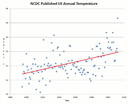
To get the original New Zealand temperature readings, you register on NIWA’s web site, download what you want and make your own graph. We did that, but the result looked nothing like the official graph. Instead, we were surprised to get this:

Straight away you can see there’s no slope - either up or down. The temperatures are remarkably constant way back to the 1850s. Of course, the temperature still varies from year to year, but the trend stays level - statistically insignificant at 0.06C per century since 1850. Putting these two graphs side by side, you can see huge differences. What is going on?
Why does NIWA’s graph show strong warming, but graphing their own raw data looks completely different? Their graph shows warming, but the actual temperature readings show none whatsoever! Have the readings in the official NIWA graph been adjusted?
It is relatively easy to find out. We compared raw data for each station (from NIWA’s web site) with the adjusted official data, which we obtained from one of Dr Salinger’s colleagues. Requests for this information from Dr Salinger himself over the years, by different scientists, have long gone unanswered, but now we might discover the truth.
Proof of man-made warming? What did we find? First, the station histories are unremarkable. There are no reasons for any large corrections. But we were astonished to find that strong adjustments have indeed been made. About half the adjustments actually created a warming trend where none existed; the other half greatly exaggerated existing warming. All the adjustments increased or even created a warming trend, with only one (Dunedin) going the other way and slightly reducing the original trend.

The shocking truth is that the oldest readings have been cranked way down and later readings artificially lifted to give a false impression of warming, as documented below. There is nothing in the station histories to warrant these adjustments and to date Dr Salinger and NIWA have not revealed why they did this.

See much more of this detailed analysis here. NIWA responds to the charges here but Anthony Watts uses instrument photo located at NIWA headquarters to cast doubt on their claims here. See also how the government is hell bent on moving forward with carbon emission schemes choosing to believe agenda driven government scientists here.
This was not to be an isolated incident, as Anthony Watts discovered in a guest post by Willis Eschenbach when he examined the temperature in Darwin Australia. I will cover this in Part three.
No comments:
Post a Comment