


A very clever trick used often by many alarmists is to use what is called Chartmanship to prove their case. Chartmanship is best defined as the art of using graphs to mislead without actually cheating. (Any emphasis used is mine.)


Take the graphs above as an example:
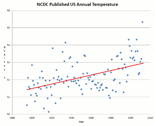
Let us take some raw data that you wish to present to the lay public, say a plot of temperature against time: As in the top figure. (If it seems familiar it should be, I used it earlier in this blog).
The graphic designer wishes to emphasise the effect required by the story, so he uses three standard techniques:
(a) suppress the zero, so that visual appreciation of the proportional increase is removed.
(b) make the vertical range exactly equal to the range of the data.
(c) use an aspect ratio that increases the apparent slope of the curve.
Now, it is fairly clear that the graph shows two flattish periods and two rising periods. Let us also suppose, for the sake of argument, that in order to satisfy your paymasters you need to emphasise the importance of the second rise, while diminishing that of the first.
There are three techniques that help.
There are three techniques that help.
The first is to put in a base line at the most helpful level, which is at the beginning of the period you wish to emphasise.
The second is to chop off the first plateau, which reinforces the illusion that the second is a natural level.
The third is to make use of colour. By perception and tradition the hot colour is red and the cold colour is blue.
The result is a form of the same chart, but one which a completely different impression to the non mathematician:
The curves (bottom figure) are taken from the web site of the Climate Research Unit at the University of East Anglia.
So to the casual observer the impression is given that the temperature is moving from below normal which is cold, to well above normal which is very hot.
Data manipulation and chartmanship techniques are often used to “prove” the case for Climate Change and Global Warming. If the raw data doesn't fit the computer model, simply keep removing data which is then labelled “inaccurate” or “corrupted” until the modified data does meet the expected outcome.
No comments:
Post a Comment