


The graph above shows a close up of what the temperature has done since 1998. It was recorded from the three other recognised authorities for recording temperature:
The UK’s Hadley Climate Research Unit of the University of East Anglia (HadCRUT)
Remote Sensing Systems (RSS)
University of Alabama - Huntsville (UAH)
NASA (GISS) reports only land-based data, and reports a modest warming trend and recent cooling. The other three global temperature records use a mix of sea based and land based measurements (HadCRUT), or satellite only (RSS and UAH) – Dr. David Evans July 2008. (My emphasis added)
As can be seen 1998 was the peak followed by a drop, another rise to a plateau and then a dramatic fall from 2007 into 2008. What can also be seen in this is the similarity of the temperature data between the two satellite based measurement systems (UAH and RSS) and the divergence in the recorded temperature by HadCRUT from the two satellite based temperature sets. This is discussed by Steve McIntyre of Climate Audit: Link
Contrary to ...... assertion ("Urban heat island effects are corrected for in the surface records"), there is no evidence that CRU or NOAA correct their records for urban heat island effects. They make a very slight allowance in their “uncertainty” for UHI relying ultimately on an estimate made in Jones et al 1990, a study which made untrue (and impossible) claims about quality control steps.
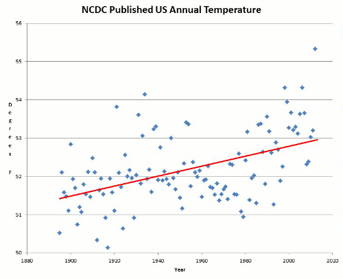
The only network where a plausible adjustment is made is the GISS US network (representing less than 2% of the world’s surface, as NASA GISS reminds us.) Unlike CRU and NOAA, GISS makes a decent effort to adjust for UHI in the U.S. (outside the USA, its efforts are risible.)
.....While GISS US results are plausible, outside the US, the GISS adjustment is a pig’s breakfast and no sane person can claim that they live up to the warranty. What makes this frustrating is that the US temperature history (GISS version) had 1934 as a record year - a result that was at variance with the other indices and other parts of the world. Is this because this is the only network/country combination with an effective UHI adjustment or because of a unique “regional” climate history in the US?
So we find The NASA GISS, NOAA and HadCRUT temperature data all being increasingly divergent over time. As can be see here:


This figure above is a comparison between UAH (satellite based) and HadCRUT (surface based) measurements. Whilst they start out fairly similar a increasing divergence can be seen between the two data sets. Interestingly, HadCRUT recognise the better accuracy of the satellite based information, but they don't use it in the calculation of their global temperatures.

This figure above is a comparison between the satellite based UAH and James Hansen's NASA GISS which uses only land based surface measurements.

As can be seen the global temperature varies up and down at various times. However in January of 2007 there was a dramatic fall recorded by three of the data sets. So how much did it fall after January 2007 (Given that it had risen by only + 0.6 OC over the 100 years of the 20th Century.) to January 2008?
(RSS) = - 0.588 OC
(UAH) = - 0.629 OC


Believers try to support their claims of continued rising trends of temperature by using long straight lines through these graphs that extend beyond the period of temperature decline with no alteration to their trajectory. As can be seen from the UAH graph above however, the trend over the last 30 years of satellite data appears to cyclical and for the time being at least - falling.
So again, why the divergence?
“Land- base temperature readings are corrupted by the ‘urban heat island’ effect: urban areas encroaching on thermometer stations warm the micro climate around the thermometer, due to vegetation changes, concrete, cars, houses. Satellite data is the only temperature data we can trust, but it only goes back to 1979." – Dr. David Evans (PhD, mathematician, carbon accountant, computer and electrical engineer and head of “Science Speak” Australia July 2008)
“There is a problem with worldwide warming…it stopped in 1998.” - Professor Bob Carter (PhD, Palaeoclimatologist, Professor of the Marine Geophysical Laboratory, James Cook University, Townsville April 2006)
“In reality, global temperatures have stopped rising. Data for both the surface and the lower air show no warming since 1999. That makes no sense by the hypothesis of global warming driven mainly by CO2, because the amount of CO2 in the air has gone on increasing. But the fact that the Sun is beginning to neglect its climatic duty – of battling away the cosmic rays that come from ‘the chilling stars’ – fits beautifully with this apparent end of global warming.” - Dr. Nigel Calder (July 2007)
When examining the downward trend in temperature since 2002 as shown three figures ago, Steve McIntyre of climateaudit.org noticed in October 2008 that NASA GISS recorded a large spike in temperature that wasn’t recorded by the others. He became suspicious given NASA GISS’s past errors and investigated. The result was: Link
(Nov 2008)In the last few days, NASA has been forced to withdraw erroneous October temperature data. The NASA GISS site is down, but NASA spokesman Gavin Schmidt said at their blog outlet that "The processing algorithm worked fine."
Schmidt blamed the failure on defects in a product from a NASA supplier and expressed irritation that NASA should bear any responsibility for defects attributable to a supplier.
Although NASA blamed the error on their supplier (GHCN), in previous publications by Hansen et al, NASA had asserted that their supplier carried out "extensive quality control": and that NASA (GISS) carried out their own quality control and verification of near real-time data.
Schmidt said that no one at NASA was even employed on a full-time basis to carry out quality control for the the widely used GISS temperature estimates.
Schmidt said that independent quality control would require a budget increase of about $500,000. NASA supporters called on critics to send personal checks to NASA to help them improve their quality.
So one of the two temperature measuring systems relied upon by the IPCC is only staffed by part timers for quality control.
No comments:
Post a Comment