


By 2001 the Third IPCC report was produced. It was claimed that the tenancy of models to warm had been overcome, however, what was produced was a simulation that stretched over 1000 years that showed no long term global trend or significant variation in its periodic oscillations. The IPCC was promoting that the temperature had stayed essentially the same for 900 years but suddenly it took off in the last 100 years disappearing out of sight in the right hand top corner. This came to be known as the “Mann’s Hockey Stick” graph as it was developed in 1998 by Mann, Bradley and Hughes (seen above).


The hockey stick (so named because it is a long stick with a sharp curved blade at the end). For a while was everywhere - unimpeachable evidence that mankind was damaging the planet - an impact that would require drastic measures to reverse. The stick's most famous outing however was just a couple of years ago when it made a headlining appearance in Al Gore's drama-documentary, “An Inconvenient Truth”, as seen above. Ever the dramatic showman, Al Gore even used a elevated work platform to emphasize the blade part of the graph to his audience. The revelation of the long, thin graph with its dramatic temperature rise in the last few decades, and the audience gasps that accompanied it, is something of a key moment for many environmentalists.– Bishop Hill
It was then famously debunked by a Canadian statistician called Steve McIntyre and his associate Ross McKitrick over a period of time. As detailed in this link:
Shortly after its publication, the hockey stick and its main author, Michael Mann, came under attack from Steve McIntyre, a retired statistician from Canada. In a series of scientific papers and later on his blog, Climate Audit, McIntyre took issue with the novel statistical procedures used by the hockey stick's authors. He was able to demonstrate that the way they had extracted the temperature signal from the tree ring records was biased so as to choose hockey-stick shaped graphs in preference to other shapes.
The controversy raged for several years, involving blue riband panels, innumerable blog postings, endless name-calling and dark insinuations about motivations and conflicts of interest.- Bishop Hill
McIntyre and McKitrick eventually completely discredited the hockey stick graph. It is even reported that he showed that even if random phone numbers were entered into the formula a hockey stick curve would eventuate.
In adition to them it was again debunked in the United States Congress by the world-renowned statistics expert Edward Wegman.
The Wegman Report was sufficiently damning that, until now, the United Nations has distanced itself from Mann’s graph, which did not appear in the Fourth Assessment Report published in 2007. From the Congressional report led by Wegman came the following conclusion: “The [Mann] methodology puts undue emphasis on those proxies that do exhibit the hockey stick shape and this is the fundamental flaw.”

This of course is roundly disputed by the believers of AGW and they often site other studies that have recreated Mann's Hockey stick shape graph. Of course if the maths that it was based on always produces a hockey stick shape then that would be the outcome. We should also bear in mind that this is the graph that was designed to remove the one piece of historical evidence that was enormously inconvenient to the believers cause, namely the medieval warm period experienced in Europe which was a widely recognised period where the temperature was warmer that today. A comparison of the graphs is shown above.
It was removed from the IPCC Assessment 4 report in 2007. A subsequent effort in 2008 was made by Mann to reintroduce a new version of his hockey stick graph and this too was debunked by McIntyre. As can be seen in this link:
For a full history of the Hockey Stick Graph controversy try looking at this link. Just a word of warning the maths used is fairly intense for most people to understand but you can see the process that was used to debunk the graph.
This of course has not stopped the UN from again trying to uses a version of a hockey stick graph in one of their reports in 2009. As seen here. A graph that was sourced from Wikipedia of all sources and who's author admits:
“ ‘My’ graph has not been published in a peer-reviewed journal since I am not a climatologist,” he wrote in an e-mail to TalkingAboutTheWeather.com. “The graph has been drawn using data that have undergone peer-review. That means that the graph is ‘mine’ only in a very restricted sense, viz. that I have drawn it – the underlying data [are] not mine, as the source provided clearly indicates. I have no qualification to judge whether the underlying data are correct or erroneous, and have never pretended to be able to do so.”
But none of this matters to the UN, as can be seen when:
United Nations Environment Programme Director Achim Steiner, whose staff produced the report with the Wikipedia graph, did not answer repeated requests for comment.
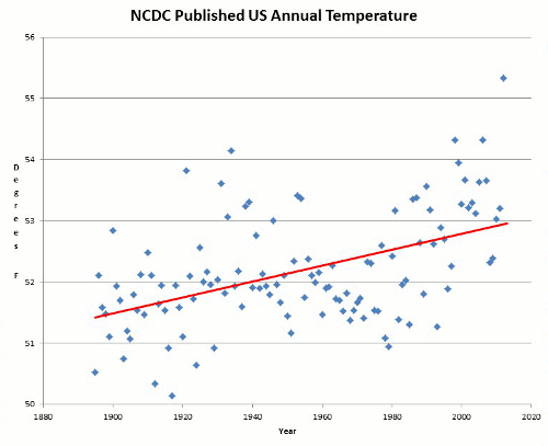
No surprise that you leave out the little detail that the "hockey stick" graph actually turned out to be correct, as demonstrated by the warming we've seen since 1998.
ReplyDeletehttp://www.rap.ucar.edu/projects/rc4a/millennium/refs/Wahl_ClimChange2007.pdf