


Meteorologist Anthony Watts has been conducting a survey of American ground weather stations and the results he has found are interesting reading.
With 82% of the US network surveyed only 10% of those surface stations rated as best or good(Classes 1 and 2). A further 22% are rated as fair (Class 3) and a whopping 69% are rated as poor or worst (Classes 4 and 5).

Class 2(CRN2) - Same as Class 1 with the following differences. Surrounding Vegetation <25>5deg.
Class 3 (CRN3) (error >=1C) - Same as Class 2, except no artificial heating sources within 10 meters.
Class 4 (CRN4) (error >= 2C) - Artificial heating sources <10>= 5C) - Temperature sensor located next to/above an artificial heating source, such a building, roof top, parking lot, or concrete surface."
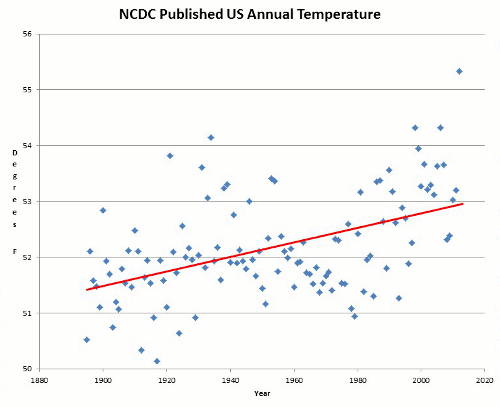
An this is from the country with the exclaimed best maintained network in the world.
Not restricting himself to the USA , when shown a picture of an Australian site, seen in the photos below, he wrote:

Yet look at the pictures, this station is only 2 meters from a sidewalk, and a couple of meters more from a major street intersection and voluminous traffic. Hardly the best place to measure temperature. This site demonstrates the growing trend of climate monitoring stations that have been gradually surrounded by increasingly closer urban influences, and demonstrates that the problem is not unique to the USA.


The Laverton station however has increased only slightly by comparison.
According to Joseph D’Aleo (BS, MS, and a Fellow of the American Meteorological Society (AMS). He was the first Director of Meteorology at the cable TV Weather Channel. Former Chief Meteorologist at Weather Services International Corporation and Senior Editor of “Dr. Dewpoint” for WSI’s popular Intellicast.com web site.) another problem with the ground weather stations is:
Station dropout. 2/3rds of the world’s stations, many rural areas in the FSU stopped reporting around 1990.

This is a point that is hotly contested by some scientists from James Hansen's NASA GISS team and the Realclimate blog site. NASA GISS are one of the four main recognised temperature monitoring agencies and are often used as a reference by the promoters of global warming/climate change theory. They of course only use surface station data to complete their analysis. They claim that Joe D'Aleo is being deliberately misleading by raising this and that any reduction in surface station numbers around the world (particularly all those cooler rural based ones) does not affect the quality of their data. Of course if they record a warming trend which suits their agenda, they probably would say that. So once again let us check NASA GISS's data against that of UAH's AQUA satellite and see how the two compare:

Continuing with the comments from Joe D'Aleo:
…Satellite microwave sensing is not subject to any of these problems and provides full global coverage. It integrates local warming due to urbanization. It is as a result is the most reliable and trustworthy. Unfortunately the data extends only back to 1979.
As mentioned earlier Anthony Watts started a volunteer effort to survey US climate stations in the 1221 USHCN network using the governments own criteria on surfacestations.org.

The two figures above and below are an example of a properly maintained weather station versus one suffering from Heat Island Effect in the USA. The one above is a class one site that has been properly maintained for a very long period of time. Note the GISS temperature chart in the bottom right hand corner.

NASA GISS claim to compensate for the UHI effect,which is apparently true in the USA, however, their methods outside the USA are questionable. As can be seen by this quote from Steve McIntyre:
...as to GISS adjustments, as we’ve discussed here in the past (and I’ll review briefly), outside the US, they have the odd situation where “negative UHI adjustments” are as common as “positive UHI adjustments”, raising serious questions about whether the method accomplishes anything at all, as opposed to simply being a Marvelous Toy. And CRU and NOAA don’t even bother.
McIntyre also had an extraordinary situation develop in 2009 when he made repeated freedom of information requests of the UK Met Office and the keepers of the historical data, the Climate Research Unit (CRU) in East Anglia:
But probably nothing could damage the credibility of climate change believers than the recent revelation by the Climatic Research Unit (CRU) that it has lost or destroyed all the original data used to construct historic global temperature records. The CRU, at the University of East Anglia in the UK, which has been using information collected from weather stations across the globe for decades, is probably the most widely cited source worldwide for those mounting a case that the earth has exhibited an inexorable warming trend: its website boasts that CRU’s research has “set the agenda for the major research effort in, and political preoccupation with, climate research.” The critical raw climate data responsible, which scientists of all climate-creeds have a natural interest in, is now gone, apparently, forever. With the exception of a handful of countries that the CRU has agreements with to sell its data, all that remains for the bulk of the statistics are “value added” versions, which is to say, consolidated, homogenized data. Actually, the CRU says it doesn’t even have all the data for countries it has data-sharing agreements with. “We know that there were others, but cannot locate them, possibly as we've moved offices several times during the 1980s,” the CRU writes in a rather embarrassing explanation for all this posted on its website.
The Unit makes this admission now, coincidentally, as it faced a flurry of requests, under Britain’s Freedom of Information Act, to make available its data to interested researchers. The CRU, it seems, had not been much in a sharing mood prior to that. UK's register reports that Professor Phil Jones, the fellow in charge of maintaining the CRU data set, told an Australian researcher a few years back that he refused to publicly share his statistics. “We have 25 or so years invested in the work. Why should I make the data available to you, when your aim is to try and find something wrong with it?” The idea that scientific progress rests completely on the constant testing and retesting, verifying and refuting, of studies, seems not to be shared by Mr. Jones, even though this particular data set had massive implications for policymaking in pretty well every country on the planet. Unfortunately for him, as part of a publicly managed and funded organization, his group was nonetheless subject to transparency laws, and so, when researchers sought to shake the data loose without his consent, it had mysteriously vanished. “We have never had sufficient resources to keep track of the exact source of each individual monthly value,” they explained in coming up dry for the FOI requests. As Stephen McIntyre, the Canadian economist famous for his addiction to poring through volumes of mind-numbing climate statistics, and occasionally finding errors (as he did, with Ross McKitrick, in deconstructing and undermining the famous “hockey stick” graph), writes on his Climate Audit blog, it appears that the impoverished CRU even lacked filing cabinets in which to store its records.
With access only to “homogenized” consolidated data, there is no way for researchers — skeptical or believers — to verify or refute the original statistics or calculations behind the CRU’s widely relied-upon weather information. The data could be accurate, or not. It could be that temperatures haven’t been warming at the rate the CRU claims, or it could be that they’re warming faster, perhaps arguing for an even direr situation for the planet. Nor can the raw data be run through different modeling programs in order to corroborate conclusions, or question them. The science is permanently frozen into the CRU’s original grid, and we are, evidently, forced to assume everything is perfectly accurate, a relatively rare thing in complex statistical calculations compiled over decades.
Which is why Mr. McIntyre (who has also found evidence that could, maybe, suggest that the CRU has been deleting important data files from its servers) isn’t the only one incredulous and indignant over the CRU’s missing records.
… Scientists of all climate creeds know that access to basic data is critical to keeping research credible. Of course, the CRU is only one of a couple key organizations whose research based on historical weather data is used to support global warming theory. Given that the Unit has admitted now that it cannot fully substantiate its work, it raises the uncomfortable question of whether CRU’s historic climate research should be used any longer at all.
Remember that the Hadley Center (Had CRUT) data is the one most often used and quoted by the alarmists and promoters of AGW and is considered the "gold standard" by the IPCC. I wonder if they are reconsidering this classification in light of these revelations.
So as we have seen there are many plausible explanations both natural and manmade (just not CO2 related) that can explain some of the temperature variations we have seen.
Hi,
ReplyDeleteDid you do the graph showing Melbourne CBD and Laverton? If so is it possible to add a station at Durdidwarrah which is truly rural to show affect of UHI. You can post reply as comments at ABC NEWS WATCH
cheers
March