


It shows a graph of surface temperature anomaly measurements from 1860 (near the end of the widely recognised Little Ice Age) to approximately 1998 ( recognised as the peak year of temperature rise).
Viewing it you should be able to see it contains two rises of significance. The period approximately 1910 to 1940 (considered pre-mass industrial and prior to man made climate change) and approximately 1976 to 1998 (considered post-mass industrial and as a result of man made climate change).
The first thing to note here is the similarity of the rates of change in the rises. The rates of change are very similar at between 0.013 degree centigrade rise per year for the first to 0.02 degrees centigrade rise per year for the second rise period. Both are within the ranges considered by many scientists to be natural variation. Believers in Anthropogenic Global Warming would want us to believe that the current rate of warming (1976 onward) is unprecedented in human history and that temperatures have never been hotter. (My emphasis added in red).
“Some of the leading scientists are now saying we may have as little as 10 years before we cross a kind of point-of-no-return, beyond which it’s much more difficult to save the habitability of the planet in the future.” –Former Vice President Al Gore.
They would also have us believe that if left unchecked the rise in CO2 levels (caused by mass industrialisation of the Western nations economies since 1940 and others in recent history) will lead to catastrophic and irreversible changes to our climate that will result in widespread destruction of the world as we know it and possible extinction of mankind.
Gore agrees that the planet’s temperature has indeed experienced up and down cycles, but the current up cycle is too extreme. “It’s way off the charts compared to what those natural fluctuations are,” he says.
If all of this true it is indeed very scary stuff, however, the question is then, is this the warmest our planet has ever been?

Looking at the various temperature records from around the world (shown in degrees Fahrenheit ) we can see that many have occurred well before rising CO2 emissions are alleged to have started to influence temperature.
Yet the previous graph would appear to show that this is the hottest we have ever been. We should note, however, that that graph only shows changes in temperature over time not actual temperatures over time. We need a different graph to see that.
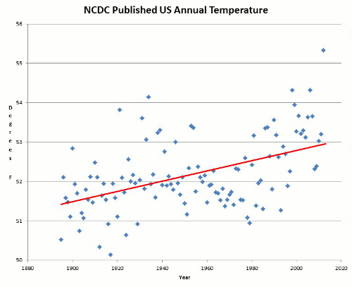
The Graph below is from the National Oceanic and Atmospheric Administration (NOAA) showing a similar time period to the top graph which we used before on the Hadley Climate Research Unit one.

Comparing them we can see in both graphs there was a cyclical event that took place in the 20th Century. A warming in temperature from approximately 1900 to 1940 a cooling from 1940 to 1976 then another warming of similar rate to the first from 1976 to 1996 where this graph ends. It should be noted that this graph doesn’t include the latter peak in 1998.
Another thing of note is that the temperatures in the late 1990’s had returned to about the same peak as was experienced in the 1930’s, where 1934 was and still is the hottest year on record in the U.S. according to NASA’s Goddard Institute for Space Studies (GISS). Not 1998 as is commonly told.
“NASA runs one of the four main measurements of world temperature, under a program run by warming alarmist James Hansen, advisor to Al Gore. Trillions of dollars are being bet by governments around the world on its claims that warming is indeed happening (and man is to blame).”
The Australian Minister for Climate Change Penny Wong is often quoted as repeating the Hadley Centre's mantra: “the 12 hottest years in history have all been in the last 13 years”. It should be noted however, that there are strong doubts that the Hadley Climate Research Unit corrects it's surface data for Urban Heat Island Effect. It also acknowledges that the satellite data available since 1979 is the most accurate, yet it does not incorporate any of it into it's temperature calculations.
This is being openly challenged by Dr. Jennifer Marohasy (PhD, a biologist and senior fellow of the Institute of Public Affairs) who says: “She is just plain wrong, …What about the medieval warming period? The historical record shows they were growing wine in England, for goodness sake; come on. It is not disputed by anyone that the Vikings arrived in Greenland in AD900 and it was warmer than Greenland is now. What Penny Wong is doing is being selective and saying that is a long time ago.”
The list of the top 10 released by NASA GISS is quite different from Penny Wong’s assertion. As seen in the next figures.


According to NASA GISS’s data that was corrected by Canadian statistician and AGW sceptic Steve McIntyre as detailed in: This Link and re-released in August 2007 the list is:
1. 1934 2. 1998
3. 1921 4. 2006
5. 1931 6. 1999
7. 1953 8. 1990
9. 1938 10. 1939
3. 1921 4. 2006
5. 1931 6. 1999
7. 1953 8. 1990
9. 1938 10. 1939
As can be seen from the data five of the top ten are from the 1930’s or earlier, an era considered pre-mass industrial (1940 onwards) with only 1998, 2006,1999 coming from the last thirteen years.
Going over the NASA historical weather graph, Steve McIntyre noticed some severe and unlikely high temperature spikes. He asked NASA for its mathematical model in an attempt to understand the same. A model is necessary because weather averages and means are based upon widely divergent observations, with sparse reporting on the high seas (thus satellites), Antarctica, and Africa.
NASA refused (of course).
McIntyre reverse engineered the model and discovered NASA had fallen victim to a Y2K bug. The result:
“NASA has now silently released corrected figures, and the changes are truly astounding.
The warmest year on record is now 1934. As seen on this Link.
Global warming increases due to increasing rate of carbon...due human activities...so please your life from great damage...plant more trees ...
ReplyDeleteCATHRIN DISUSA
Cash Online Get Easy cash at your door step
Well respectfully Cathrin, I disagree with the first parts of you comment. As this blog is showing there is a disconnect between CO2 and temperature rises.
ReplyDeleteHowever,if you wish to plant more trees then "go for it" I say. Trees are always a welcome addition but not for the reasons you state. Just don't plant big ones under powerlines ok!